When the image generator surprises you, not delights
You type a clear request—“a simple product photo,” “a friendly doctor,” “a logo with three stars”—and the result lands somewhere between off-brand and unsettling. A hand has six fingers, the shirt logo has gibberish text, the lighting looks like two suns, or the “three stars” quietly becomes four. What makes this frustrating isn’t that the image is low quality; it’s that it fails in ways that feel arbitrary, even when the prompt feels unambiguous.
These surprises show up most when you expect the tool to behave like a careful illustrator taking instructions, rather than a system making a best-guess picture from patterns it has seen. It will often optimize for “looks plausible at a glance” instead of “is correct under scrutiny,” which is fine for mood boards and rough concepts but costly for anything that needs accuracy. The practical constraint is time: every unexpected detail adds review cycles, rework, and the risk that a subtle mistake slips into a deliverable.
The hidden gap between your prompt and the model’s guess
You’re not really giving the model instructions in the way you’d brief a designer. You’re providing a short, ambiguous description, and the model fills in everything you didn’t specify: camera angle, lighting setup, materials, era, even what “friendly” should look like. Many of those defaults are invisible until they clash with your intent—like a “doctor” turning into a stock-photo stereotype, or a “simple product photo” acquiring dramatic shadows and a lifestyle background.
The gap widens because words carry multiple meanings, and the model has to pick one based on probability, not your internal definition. “Three stars” might be interpreted as a pattern, a rating badge, or a flag element. If you don’t lock down constraints (exact count, placement, style, no extra symbols), it will choose whatever looks most common in similar images. That guesswork is efficient for ideation, but it’s a reliability tax when details matter and every output needs careful checking.
Where failures cluster: hands, text, counts, and physics
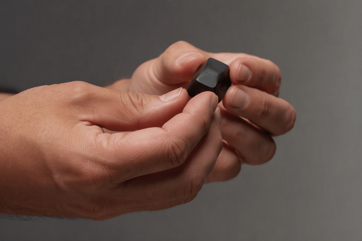
Ask for anything that depends on crisp, discrete structure and you’ll notice the same weak spots repeat. Hands and joints are the classic example: they’re highly variable, often partially hidden, and small errors still “read” as a hand at thumbnail size. The same goes for objects that must match a clean template—eyeglass frames, zippers, guitar strings, grid patterns—where one warped element makes the whole thing feel off.
Text is another cluster because the model isn’t “typesetting” letters; it’s painting shapes that resemble text. That’s why logos drift into near-misses and packaging copy turns into convincing-looking nonsense. Counting is closely related: “three buttons” or “five petals” requires the model to maintain an exact inventory across the image, not just a vibe of “button-y.”
Then there’s physics: inconsistent shadows, impossible reflections, or light sources that don’t agree. These failures aren’t random—they’re the cost of generating what looks plausible locally, even when the global scene can’t all be true at once.
Training data and defaults: why the model brings baggage
You also inherit the model’s “baggage”: the patterns and shortcuts it absorbed from its training images. If “professional headshot” is frequently paired with certain poses, lighting, and demographics in the data, the generator will reach for those defaults even when you didn’t ask for them. That’s why a neutral role prompt like “CEO” can skew toward a narrow look, and why “doctor” may come with a white coat, stethoscope, and stock-photo grin even in contexts where those details are wrong.
Those defaults extend to style and composition. Many models have a strong pull toward shallow depth of field, dramatic rim lighting, or cinematic color grading because those features are common in visually “successful” images. The catch is practical: the more you fight the baked-in look—by demanding a specific brand style, regulated product details, or a precise layout—the more iteration and manual cleanup you usually need. The tool can move fast, but it doesn’t start from a blank slate, and it doesn’t know which conventions you want to avoid unless you explicitly constrain them.
Iteration is not a workaround if you need reliability
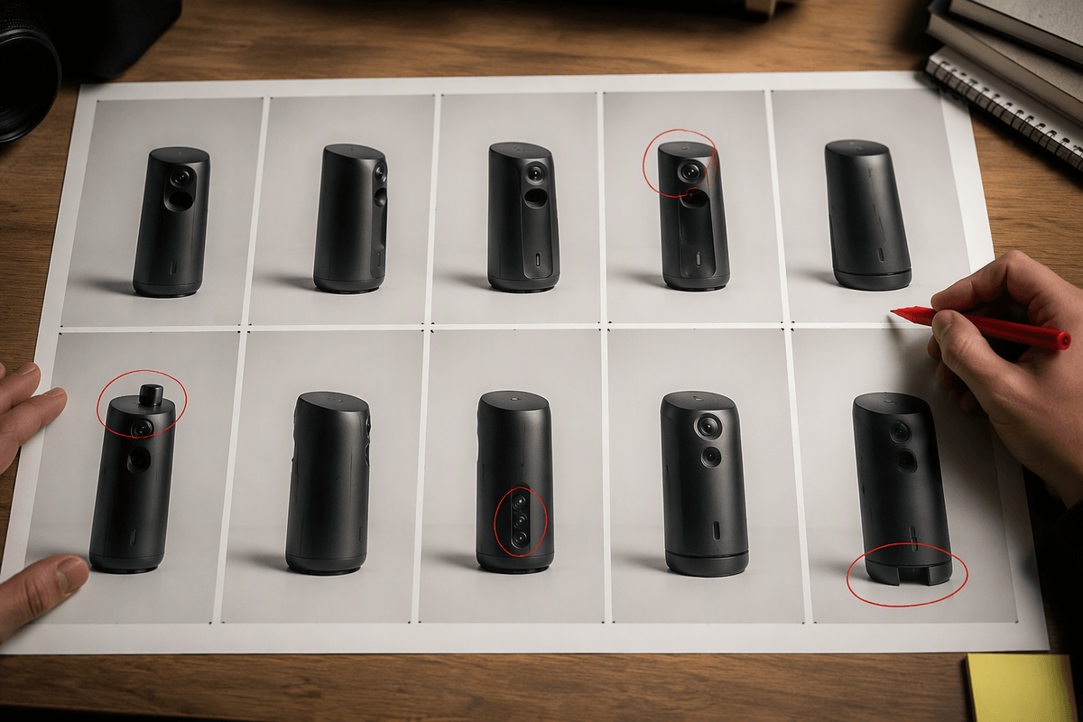
Regenerating until something usable finally appears may get the job done, but the process has more in common with auditioning than controlling. Every attempt introduces new variables: a different hand pose, a slightly altered label, an extra button, or a facial feature that shifts just enough to look wrong. Reusing the same prompt does not preserve the detail that worked in the previous result. The workflow therefore becomes a cycle of scanning, rejecting, tweaking, and trying again rather than a predictable production process.
The limitations become more obvious when consistency matters across a larger set, whether that means ten product angles, a character sheet, a campaign built around recurring props, or UI mockups that need to line up from one image to the next. Repeated generation offers no reliable way to preserve logo placement, element counts, or the visual “physics” of one frame across the rest. Volume makes the problem more expensive because every output needs review, and the hardest mistakes are usually the ones that look plausible at a glance: an extra star, a misspelled ingredient, or a connector that is subtly but meaningfully wrong. Those details are easy to overlook when someone is checking dozens of outputs in a row.
Practical controls that actually reduce unexpected results
You’ve probably noticed that longer prompts don’t automatically mean more control. The practical shift is to move from “describe the scene” to “lock the variables.” Pick a single subject, a single setting, and a single framing, then add constraints that remove common degrees of freedom: “front-facing,” “plain background,” “no text,” “exactly three stars centered,” “hands out of frame,” “single light source from the left.” Negative prompts can help, but they work best when they target specific failure modes you’ve already seen (extra limbs, watermarks, letters, brand marks) rather than broad bans like “no weird.”
When the tool allows it, use controls that reduce randomness: fix the seed for repeatability, keep the same model/version, and generate small variations instead of wide exploration. If you need consistency across multiple images, start from a reference image or a rough layout (image-to-image, pose guidance, composition controls), then iterate with tight settings so you’re refining instead of rerolling. These controls trade spontaneity for time and setup: collecting references, managing seeds, and building templates adds overhead, but it usually costs less than discovering late that the “same” object drifted across a whole set.
Using generated images responsibly in real-world contexts
You can treat a generated image like a sketch, but you can’t treat it like evidence. Before anything goes public, check the details a model commonly mangles: names and logos, readable text, counts, hands, medical or safety features, and anything that implies a real place, event, or person. For product teams, that usually means a simple checklist and a “human sign-off” step, not just aesthetic approval.
Risk climbs when the image could mislead: claims about performance, before/after results, public figures, news-like scenes, or regulated categories. In those cases, generation can still help—storyboards, internal comps, background filler—but it’s often cheaper than a legal review only if you’re willing to constrain it hard, disclose it when appropriate, and replace it when accuracy is the point.